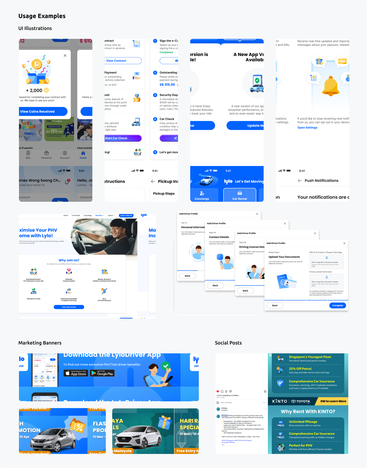
Lylo Illustration System
Background & Objectives
Lylo operates Singapore’s largest car-rental fleet, making a clear and consistent identity essential across every customer touchpoint. Illustration is a core part of that brand, building recognition, creating emotional connection and making complex messages easier to understand. As Lylo expanded across product, marketing and new sub-brands, one-off artwork could no longer provide the consistency or speed the team needed.
I led the creation of a modular illustration system that turned Lylo’s visual language into a scalable design capability. Shared tokens, reusable elements, composition rules and motion principles allow designers to create new work efficiently while keeping every touchpoint friendly, approachable and unmistakably Lylo.
Role & Responsibilities
2025 Project Owner
- Defined the system vision, creative principles and implementation roadmap
- Created a scalable visual language spanning product, marketing and motion
- Designed variable-ready colour tokens that adapt across Lylo sub-brands
- Built reusable elements and composition frameworks for efficient asset creation
- Established guidelines and governance so designers could extend the system confidently
Design Philosophy
Illustration is more than decoration—it is one of Lylo’s most recognisable brand signals. Whether tiny on a name card or enormous at an airport, it helps customers and partners recognise Lylo, connect with the brand and trust that every experience belongs to the same ecosystem.
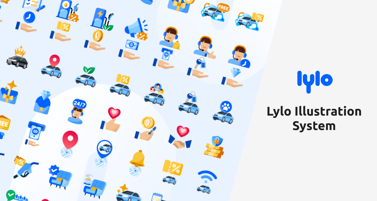
The visual language expresses Lylo as friendly, approachable and seamlessly connected. Smooth curves, rounded forms and human-centred scenes bring warmth across digital and physical touchpoints, while “Let’s Get Moving!” adds a sense of action, connection and freedom of movement.
System Design
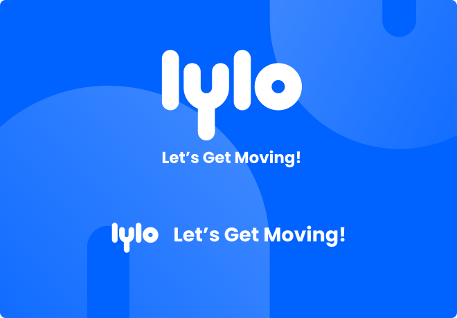
The illustration system is organised around three foundations:
- Codified visual language
- Modular, reusable assets
- Structured and flexible composition templates
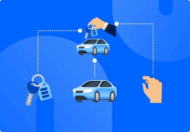
Codified Visual Language
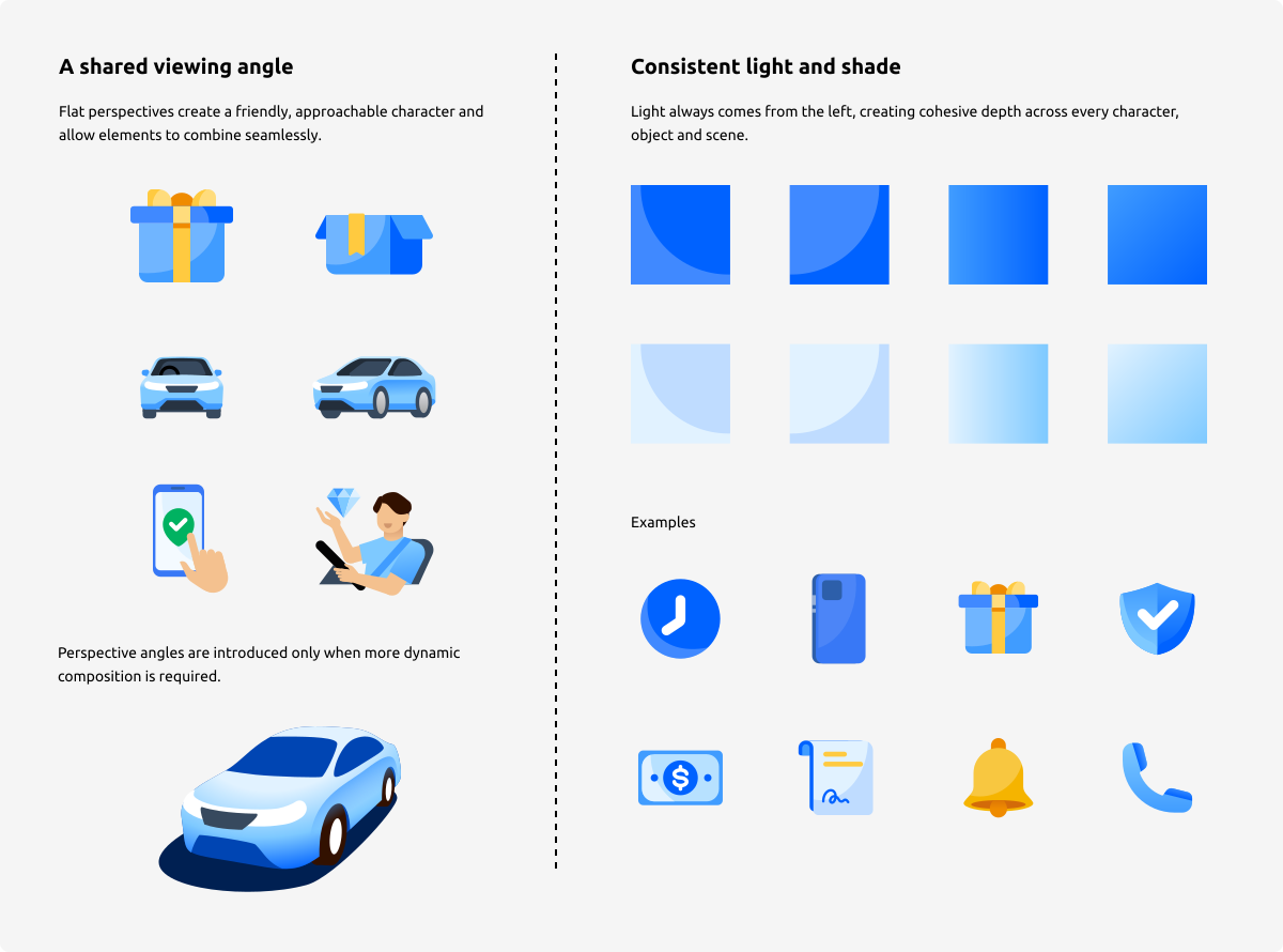
A set of rules defined to make every illustration recognisably Lylo while leaving room for the system to adapt.
- Variable-ready colour tokens — Core colour relationships remain consistent while palettes can adapt across different sub-brands.
Modular, Reusable Assets
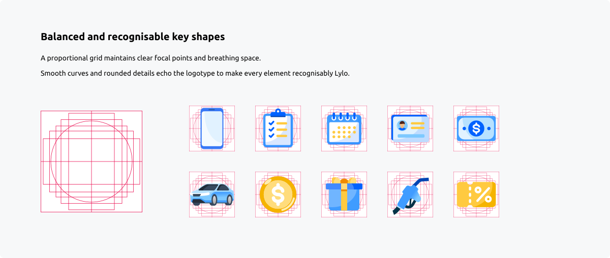
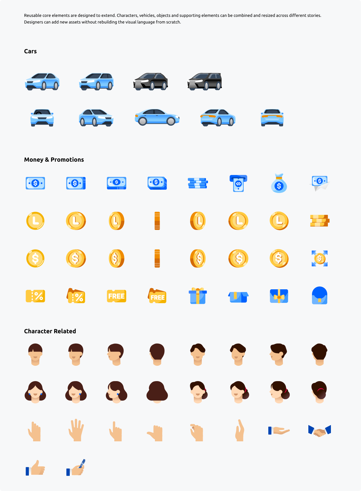
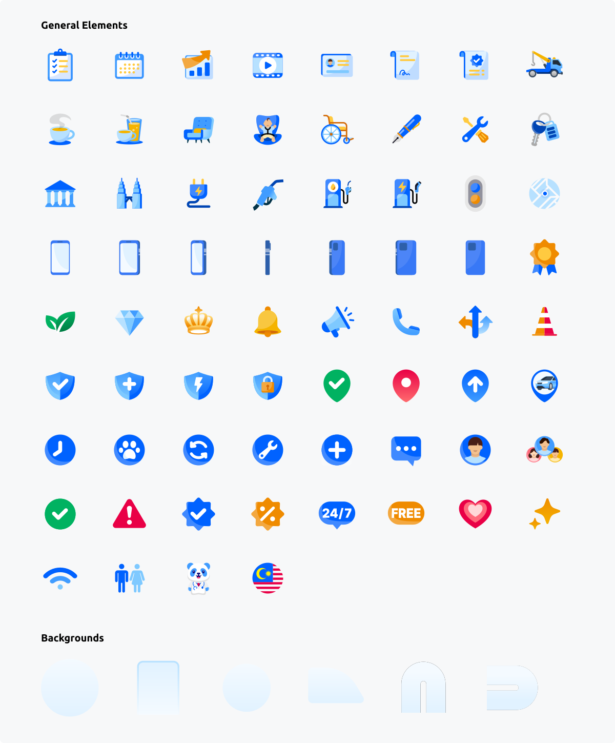
The system turns recurring brand imagery into practical building blocks that designers can reuse and build upon.
Structured and Flexible Composition Templates
Composition templates speed up common work while leaving room for more distinctive stories.
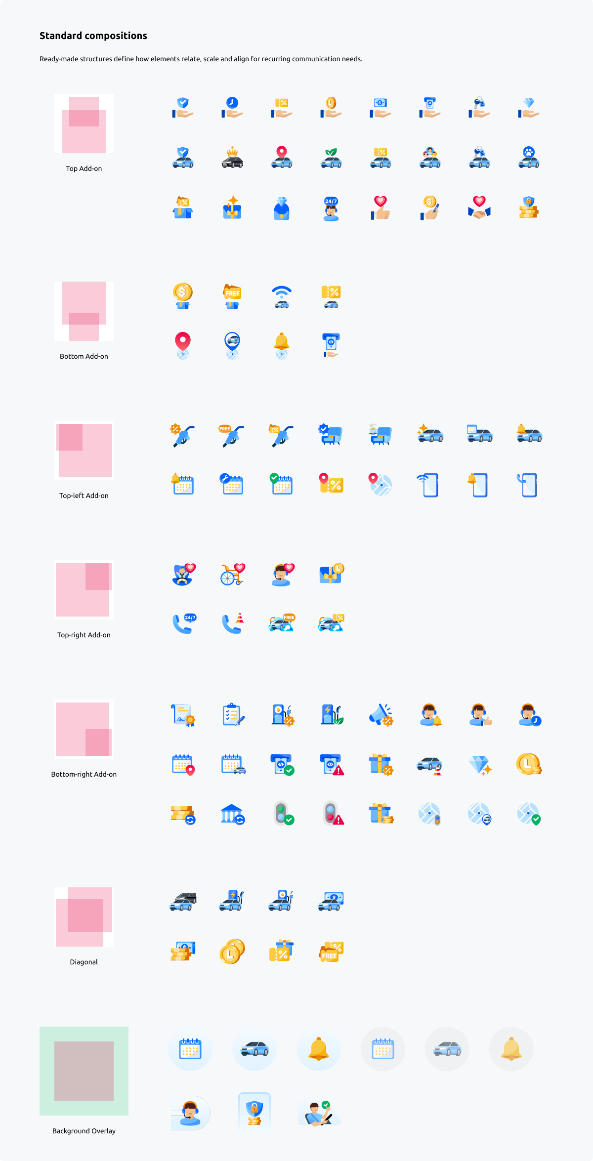
- Standard compositions — Ready-made structures define how elements relate, scale and align for recurring communication needs.
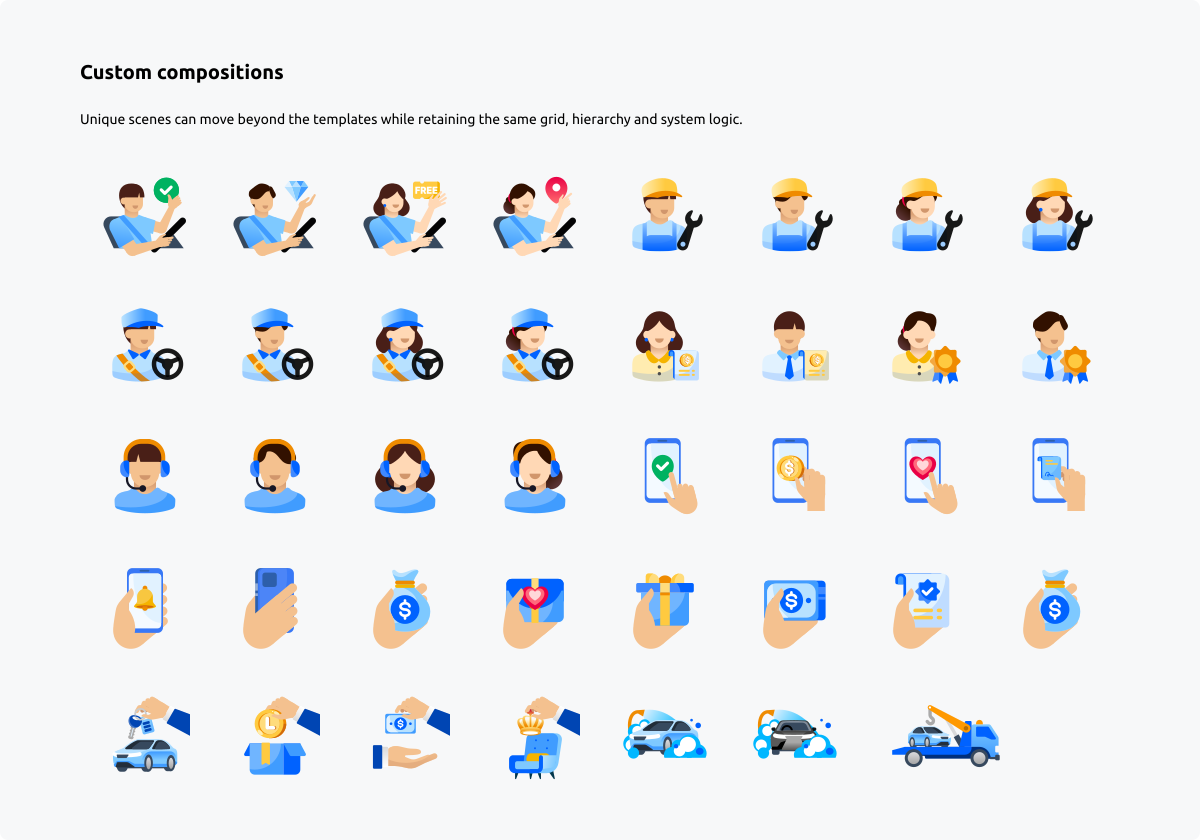
- Custom compositions — Unique scenes can move beyond the templates while retaining the same grid, hierarchy and system logic.
Motion Design
Motion extends the same visual language across digital touchpoints, using consistent pacing and transitions to guide attention and clarify interactions.
A recognisable motion signature. The default logo animation uses a refined stroke technique to create a fluid, modern entrance for the brand.



Project Impact
The system turned one-off illustration requests into a reusable brand capability. Designers can now create consistent work faster across product, marketing and sub-brands, while shared rules make every output easier to recognise as Lylo.
- 60% faster content production for recurring illustration needs.
- 40 design hours saved each month through reusable assets and templates.
- 15+ system-based assets created each week across product and marketing.
- 78% logo-free brand recognition in visual-identification testing.