Shopee Design System
Background & Objectives
Shopee is one of Southeast Asia’s leading e-commerce platforms. With the rapid expansion of its businesses and products, inconsistency in user experience became an increasingly severe problem. Designers with different personal preferences could approach similar user flows in different ways. This increased the learning cost of our products, created experiences that did not match users’ expectations and reduced development efficiency through repeated work.
Therefore, the team urgently needs a design system that serves as a clear guideline, an efficient tool and a comprehensive library that consolidates our past experiences.
The key objective of Shopee Design System is to enhance the consistency and efficiency of our product development.
Role & Responsibilities
2021-2022 Project Owner
- Build and maintain the Figma component library
- Draft design guidelines for styles and components
- Review and revise the guideline drafted by individual contributors
- Manage the SOP for guideline feedback collection, contribution, review, development and publish
- Identify pain points from our current workflow and develop design tools to improve design efficiency
Content Overview
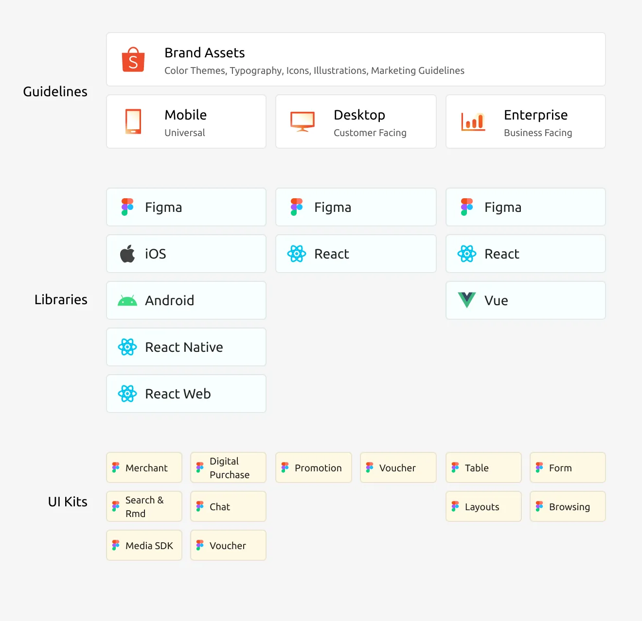
As the design team in Shopee works on a wide range of products from mobile to web desktop, from business facing to customer facing, it is important to set up a clear overall content structure for the design system.
On the top level, it is the design guidelines where all the rules and usage guides are defined. We have divided the guidelines into 3 sets of components serving mobile, desktop (2C) and enterprise (toB) respectively. All of them share a universal set of brand guidelines such as colours, fonts and icons etc.
Then, both design and front end libraries are developed based on the design guidelines. The components inside the libraries are removed of the complexities of usage rules and focused on efficiency.
Lastly, as different product lines may require different types of user flows, sub-teams will use the components from the common libraries to develop their own UI Kits that are consolidated specially for each product lines.
Workflow Overview
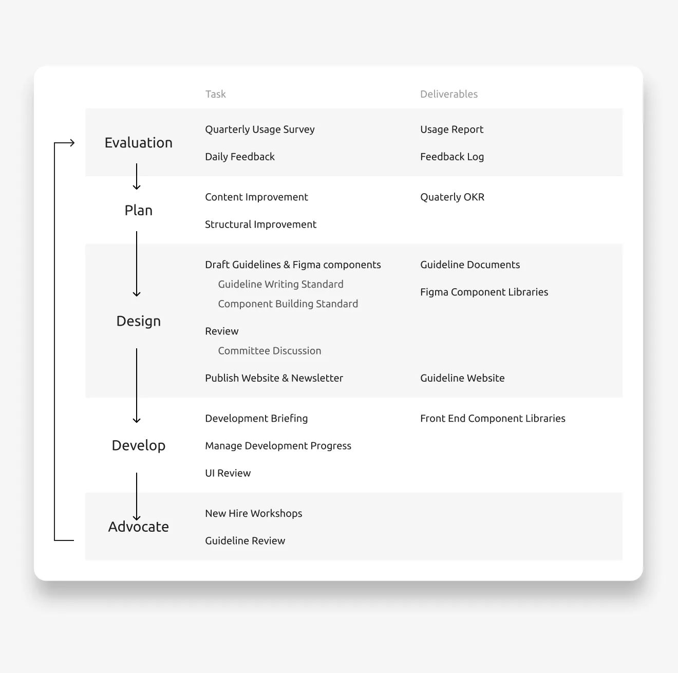
Instead of a one-time implementation, a design system is a product constantly evolving to adapt to the latest business needs. Therefore a sustainable workflow is essential.
- Evaluation: A central feedback channel was established for designers and engineers so that we can understand the pain points of their daily work.
- Plan: I will filter the feedback received and identify the key areas of improvements every quarter. Then I will prioritise the tasks and assign them to suitable designers.
- Design: New guidelines and updates are drafted and reviewed in the bi-weekly committee discussion led by me. The committee members are selected representatives from different product lines. When guideline & component drafts passed the committee review, I will publish them in the design library as well as the guideline website.
- Develop: When a new guideline update is confirmed, the detailed development request will be raised to engineering teams. I will keep track on the development progress for all components, and conduct UI review once a component’s development is finished.
- Advocate: workshops are conducted by me every quarter to teach new joiners how to use our component libraries so that they can onboard smoothly. I am also reviewing all key designs to make sure that they are following the design guidelines. Monthly newsletters will also be sent to the entire company to update teams on the changes of the design system.
Design Guidelines
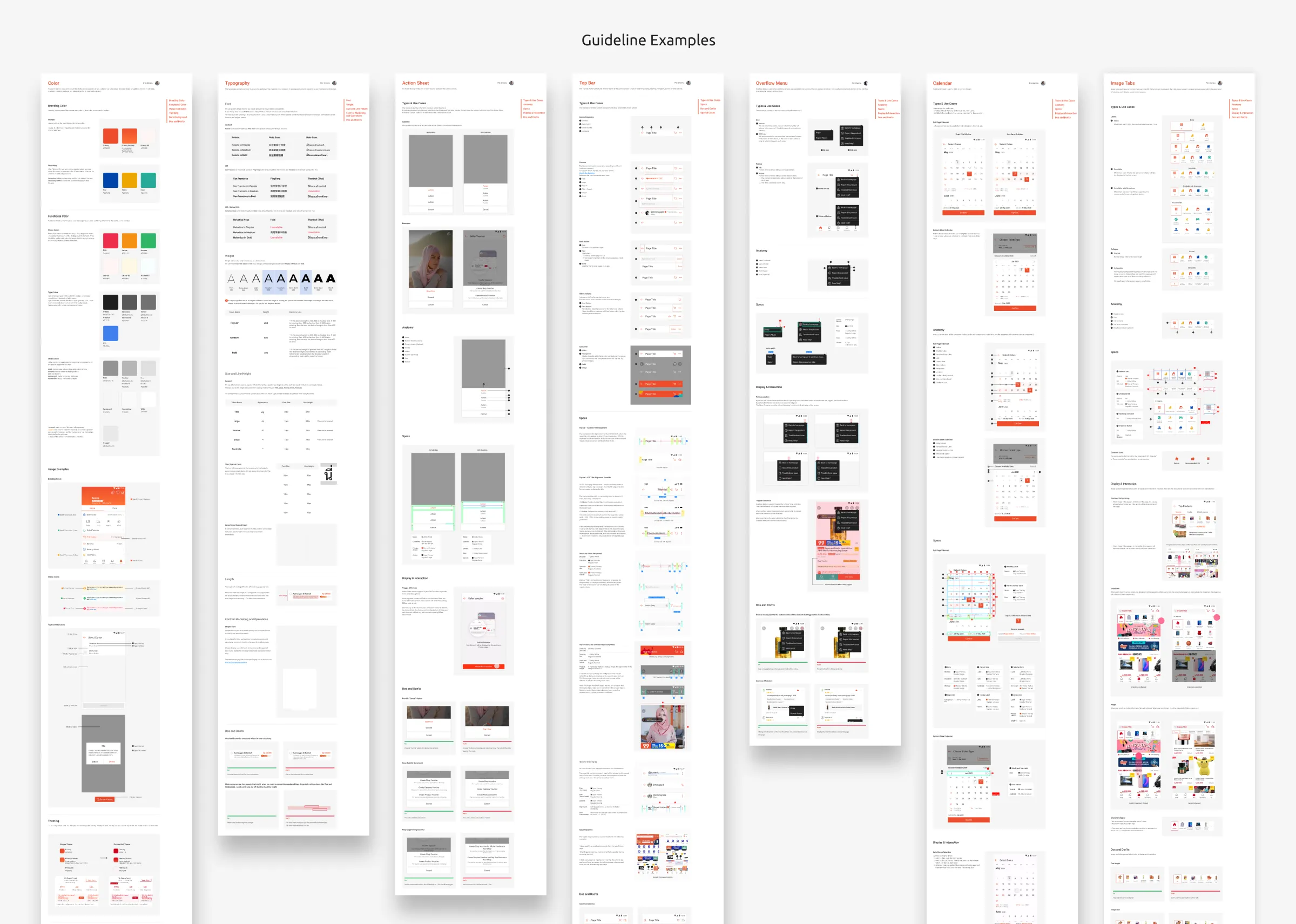
As the design guidelines are contributed by different designers, it is hard to control the quality of the content created. This resulted in many back and forth in the reviewing process, and significantly slowed down our progress.
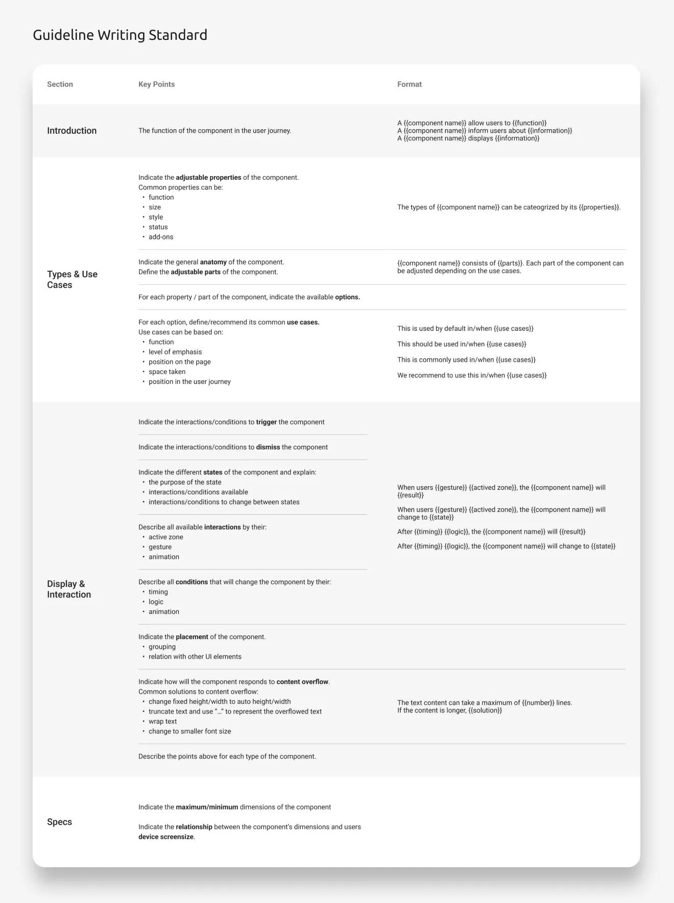
Therefore, after some initial guidelines are confirmed, I consolidated a detailed content structure and writing standard to ensure the quality and consistency of the design guidelines produced. It also makes it easier and clearer for other designers to contribute.
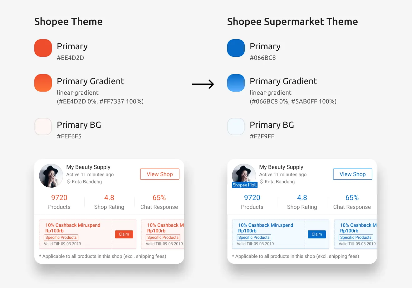
Due to the variety of brands inside Shopee App, such as Shopee Mall, Shopee Supermarket, Shopee Food, etc, design tokens are introduced in the design system so that the theme of the UI can be customised globally for different brands.
Component Libraries
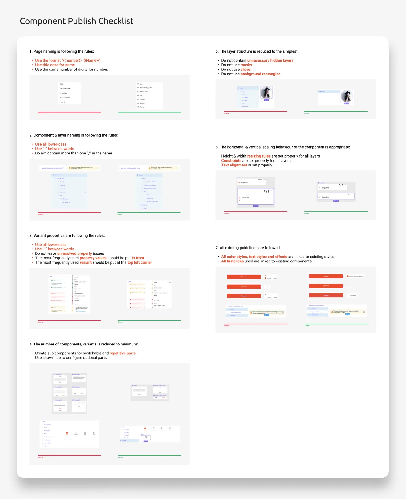
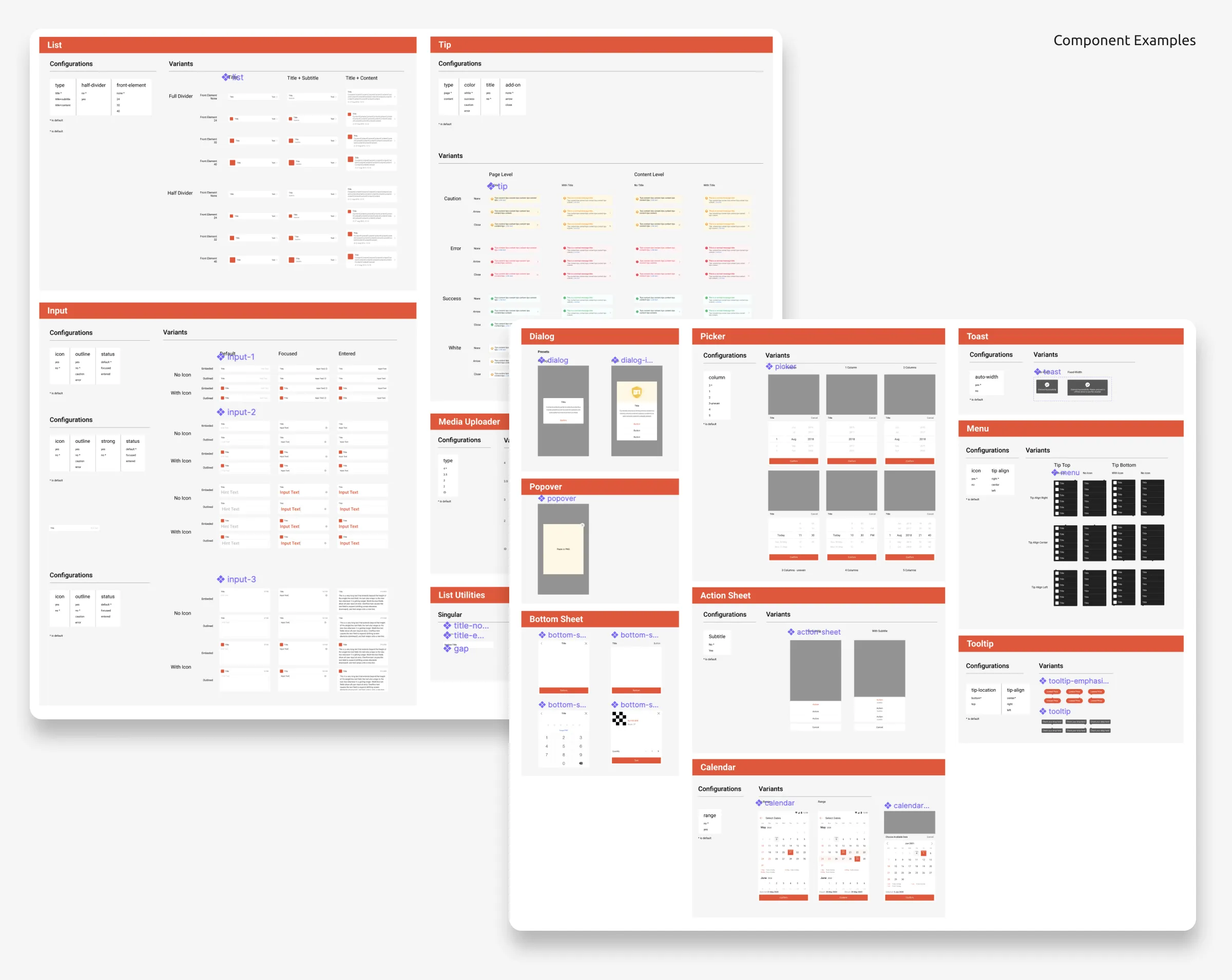
In order to reduce the learning barrier of using the component libraries, I also created a detailed checklist to ensure that all the component published are responsive, easy to use and following the same behaviour patterns.
Efficiency Plugins
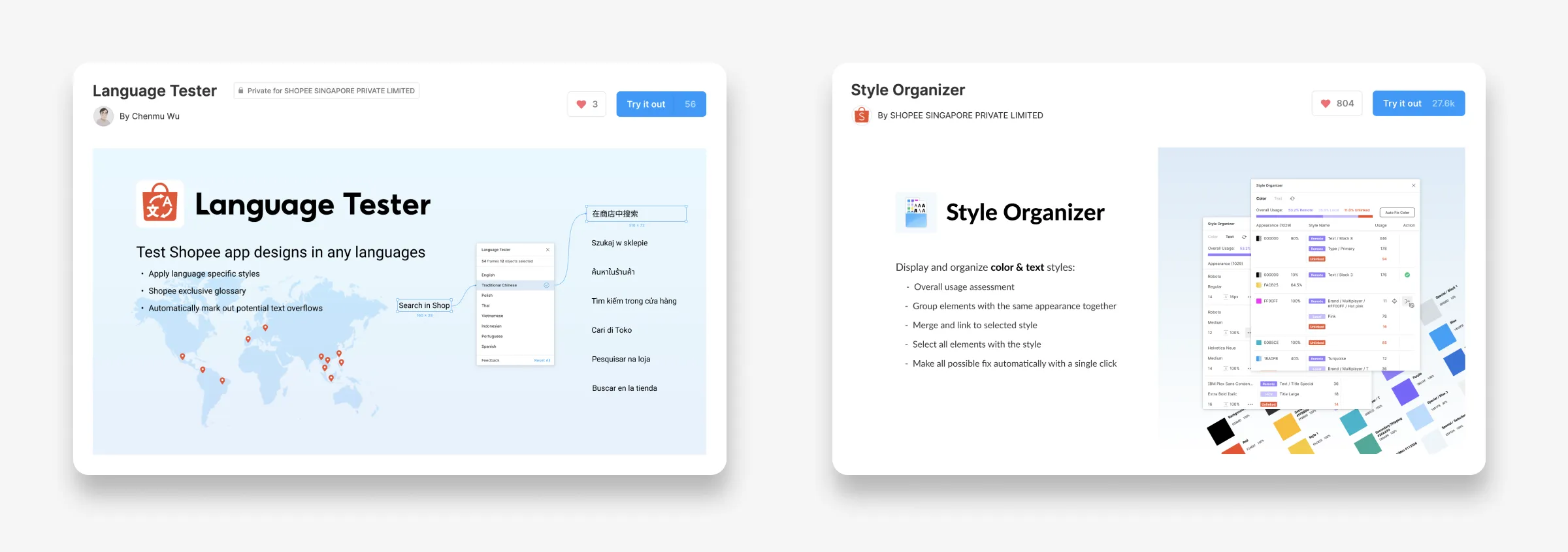
With the deep understanding of the challenges in designers’ daily work, we have also developed some internal Figma plugins based on our design system to further improve the team’s work efficiency.
Evaluation
Achievements:
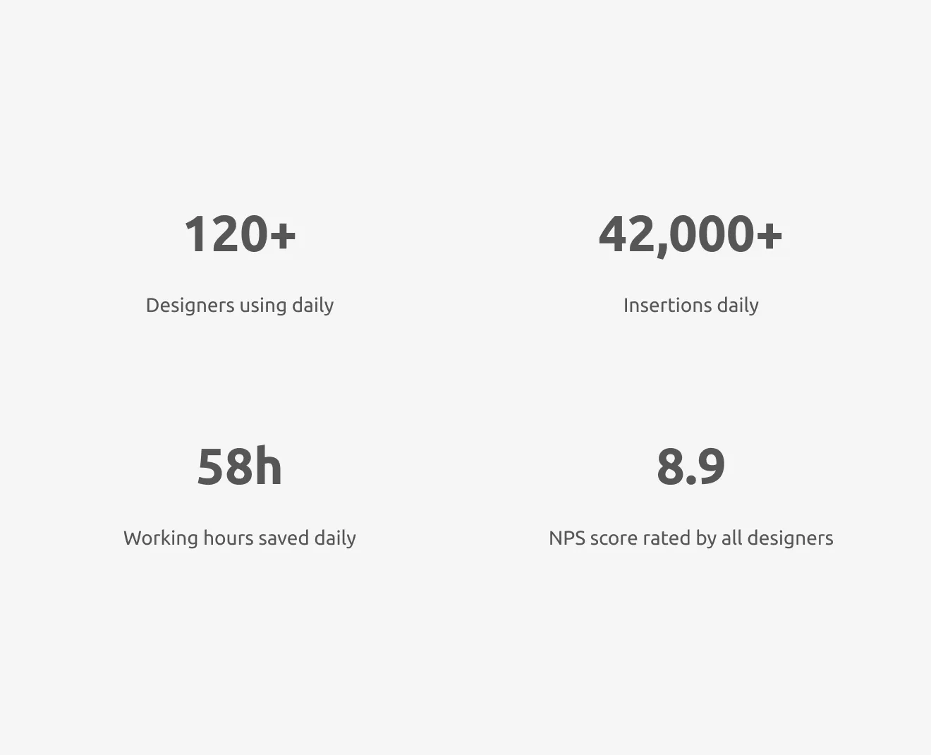
- Until 2022, Shopee Design System is serving 120+ designers from Shopee Marketplace, SeaMoney(Credit, ShopeePay), and Local E-commerce design teams.
- On average, the components are inserted in the design files over 42,000 times daily. Assuming 5 seconds is saved per usage, we are saving the design teams 58h/day.
- According to our feedback survey, the NPS score for Shopee Design System has improved from 7.1 to 8.9 since the beginning of 2021.
However, as mentioned above, a design system is a constantly evolving product. The number of common atomic UI components is finite. The granularity of the components will increase as we consolidate higher level UI patterns.
Therefore, moving forward, we are planning to shift our focus towards 3 areas:
- Product-line specific components
- Common page templates
- Efficiency tools